


With 1.7 million girl members, Girl Scouts of the USA is the largest youth organization for girls in the nation. Its rich history, spanning over 110 years, underscored the need for a comprehensive rebranding effort to align its visual and verbal identity with its enduring legacy while also signaling its relevance in a rapidly evolving world.
As the head of creative at GSUSA, I spearheaded a transformative partnership with the esteemed branding agency Collins to overhaul our visual and verbal identity, resulting in an award-winning redesign. Over two years, I collaborated closely with Collins to refine every aspect of GSUSA's brand identity, culminating in a comprehensive rebrand recognized for its excellence in identity design. The prestigious Design Week Award for ‘Best Identity Design Rebrand,’ bestowed upon our efforts, underscores the success and impact of our work in revitalizing the Girl Scouts brand.
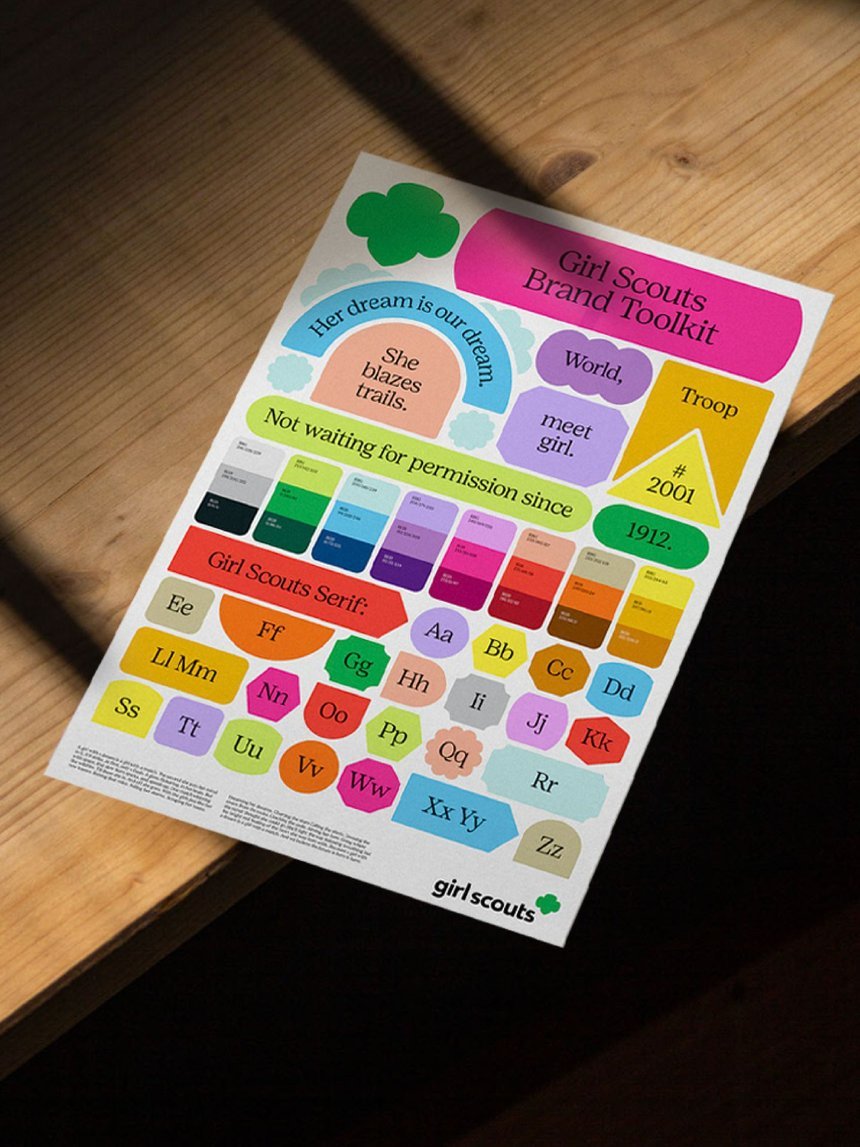
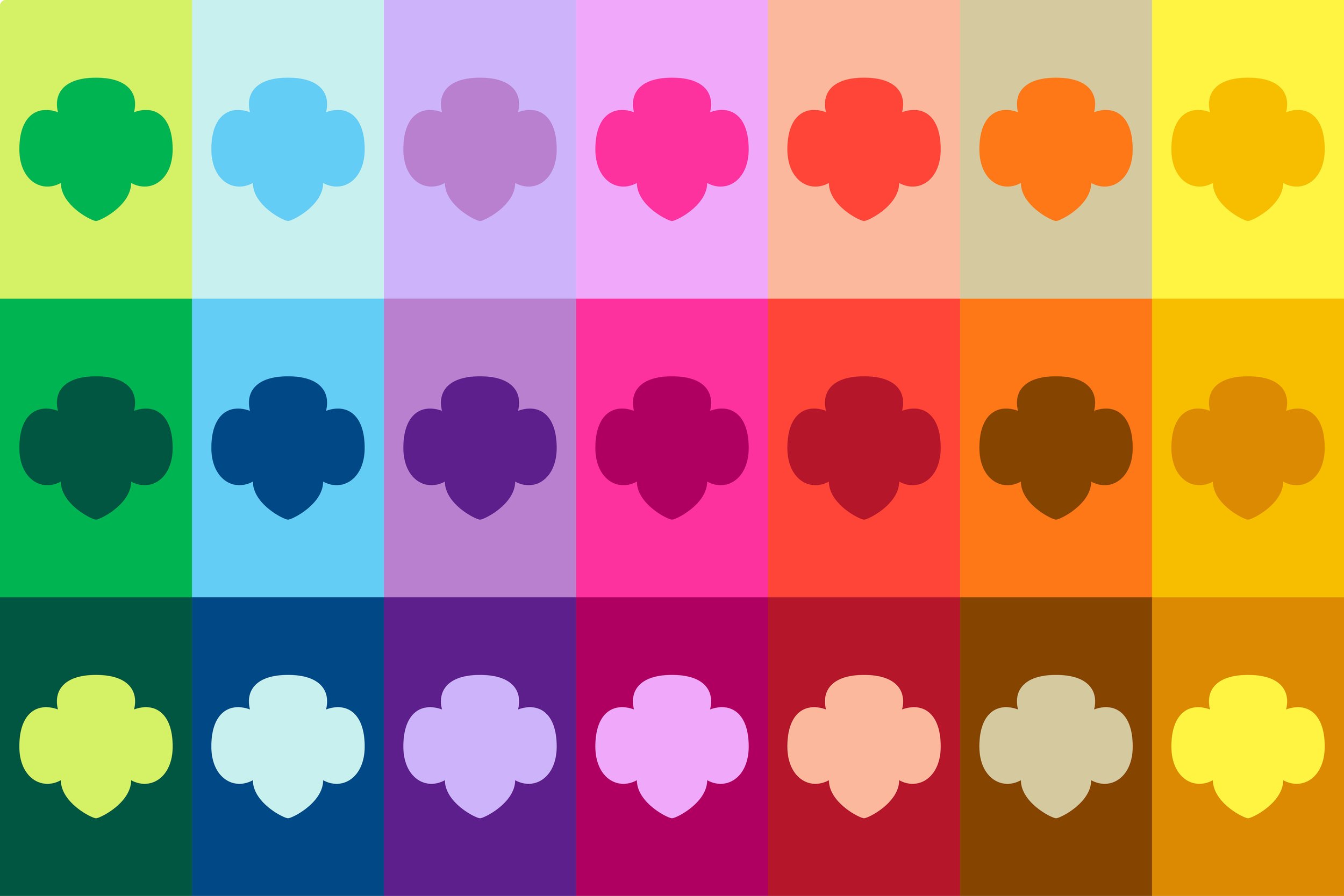
We introduced a new 'shape' design system that aligned with the organization’s iconic badge merit system. We additionally revamped our messaging to create a cohesive and compelling brand experience.
Managing the coordination and implementation of the new system with the in-house team and 112 Girl Scout councils, each functioning as an independent 501(c)3 organization, while maintaining synergy between the agency and all stakeholders posed significant challenges. However, through my strategic leadership and creative problem-solving, I successfully navigated these challenges and ensured a lengthy but seamless national rollout of the new brand across all products, programs, events and touchpoints, all while effectively engaging and bringing along the organization’s council partners, who would be key to the execution of the new brand guidelines on the local level.
The development of a new “design shape system” aligned with the core values of Girl Scouts’ emblematic badge system. It was to be utilized as the formation of every design layout for every piece of creative, in print or in digital. We also elevated the iconic ‘trefoil’ as the main logo and expanded the color palette to reflect contemporary design trends and the bold voices referred to in Girl Scouts’ mission statement (“Girl Scouts builds girls of courage, confidence, and character…”). The system also had the flexibility to utilize color combinations that speak to a variety of age levels—from the youth of a 5-year-old Daisy, to the ambitious spirit of middle and high school girls, to the adult audience that includes volunteers, parents, supporters, and alums. These color systems were developed to be applicable across all mediums of digital, print, and product design.
With the rebrand progressing rapidly, it became clear that a singular font was essential, departing from the multiple options previously available. Collaborating closely with Positype Font Foundry, I art directed the development of a custom font that embodied the spirit of Girl Scouts. Additionally, we opted for a distinct visual element by exclusively using black or white text color, reinforcing the simplicity and clarity of the new brand. I directed efforts at both the national and council levels, facilitating workshops, training sessions, and webinars to ensure seamless integration.
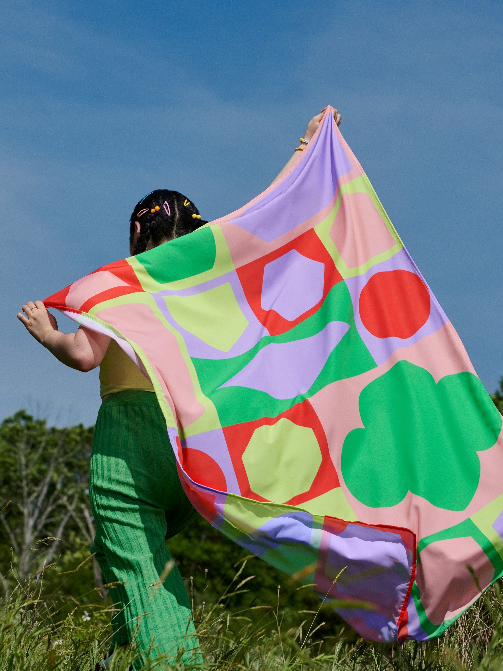
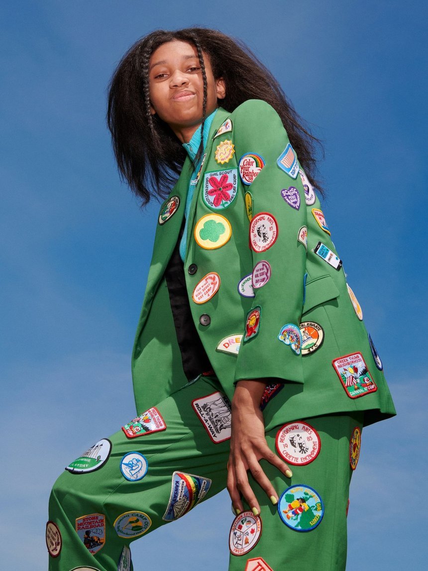
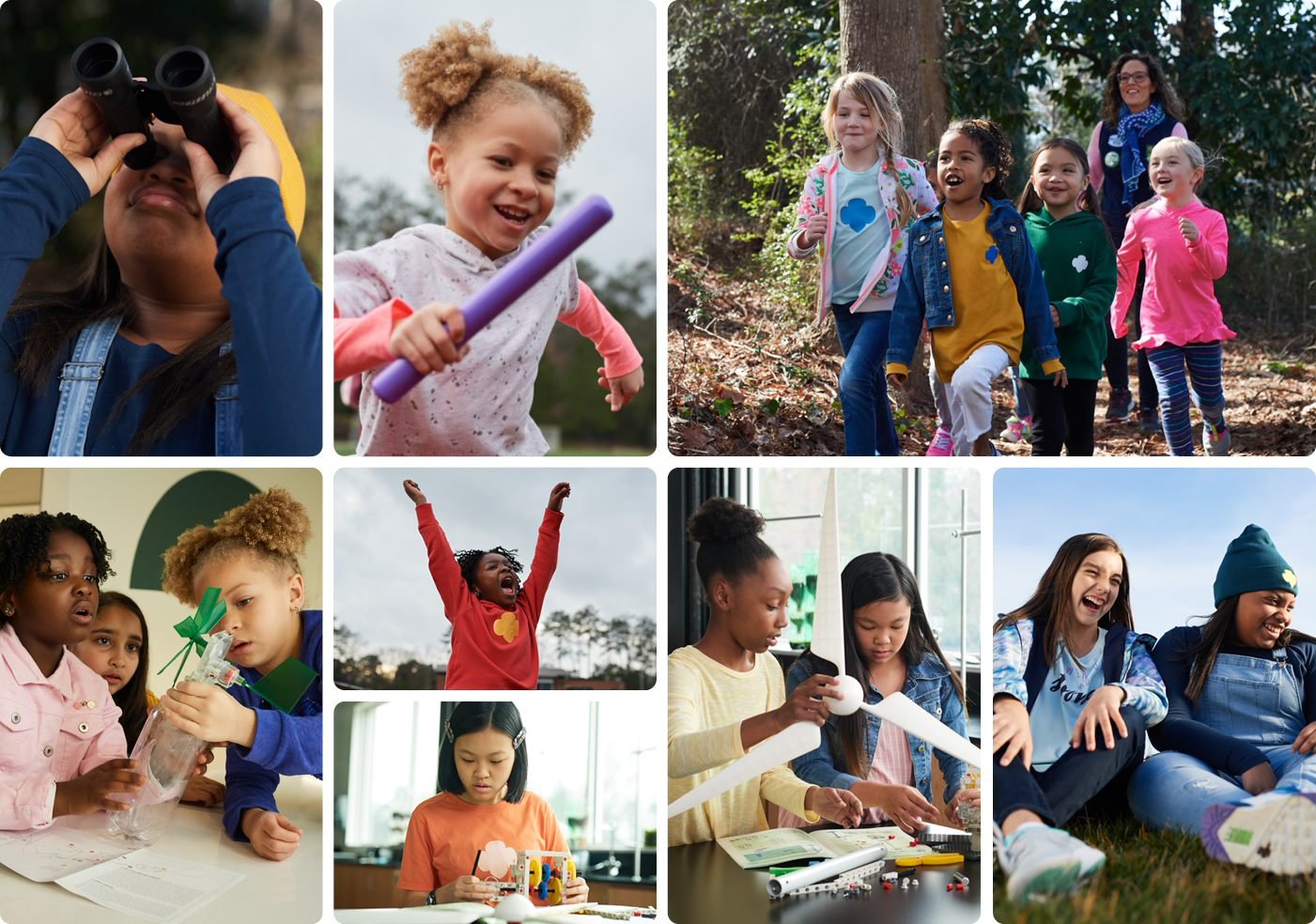
The new brand photography approach was a shift from overly posed or contrived imagery to embodying REAL girls in authentic moments and places that they experience as girls.
This editorial concept is broken into two sections:
EXPRESSION— This is who girls are.
ENVIRONMENT— This is what girls do.
I had the pleasure of being on site in Atlanta to art direct the first photoshoot in the brand style that catapulted our image library and design assets into a new era.